 This is "The Pangkor treaty of 1874" was a treaty signed between the Sir Andrew Clarke on behalf of the British and Raja Abdullah of Perak. It was signed on January 20, 1874 on the island of Pangkor off Perak. Thus, the name of the agreement.
Always Is Me
Sunday, June 12, 2011
Field Trips study ^^
After the trips i found out i more interesting in "British" how they started to paved the way for British intervention in Malaya.
 This is "The Pangkor treaty of 1874" was a treaty signed between the Sir Andrew Clarke on behalf of the British and Raja Abdullah of Perak. It was signed on January 20, 1874 on the island of Pangkor off Perak. Thus, the name of the agreement.
 This is "The Pangkor treaty of 1874" was a treaty signed between the Sir Andrew Clarke on behalf of the British and Raja Abdullah of Perak. It was signed on January 20, 1874 on the island of Pangkor off Perak. Thus, the name of the agreement.
Saturday, January 15, 2011
Saturday, January 8, 2011
Web design 2, Beautiful and useful websites
Friday, January 7, 2011
Web Design 2, Sharing
Html/java script/Css tutorials:
1. HTML codes
2.JavaScript Tutorial
3.Css Tutorial
4.XML tutorial
Design Tutorials
1.3D text design
2.Ligthing and abstract
3.Texture and backgrounds
URL>> http://www.photoshoproadmap.com/Photoshop-blog/2008/11/30/60-impressive-free-high-resolution-textures-and-backgrounds/
4.Navigation design
Web Design 2, Competitor's website
Competitor's Website >> Souled Out
 Analysis>>
- Simple layout design
- Use many box can try curve shape
- Navigation put to vivid and no hierarchy at home page
- Roll over effect at navigation can enchant
- Nice design at overall but spacing between navigation and content can be closer.
- Interesting menu book at cafe page but can try make it bigger.
- Navigation word can be bigger.
- Information font size and bottom contact font size need adjust to make focus point contrast.
 Analysis>>
- Hierarchy at this website quite good look delicious when saw this website.
- Navigation design need enchant.
- The style quite suitable for it.
 Analysis>>
- Sound effect is match for this website.
- Roll over effect is interesting like fishing.
- Typo color can try others.
- History page interesting got put some design will make audience not so boring.
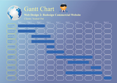
Web Design 2, Redesign Commercial Website , Souled Out
Subscribe to:
Comments (Atom)


